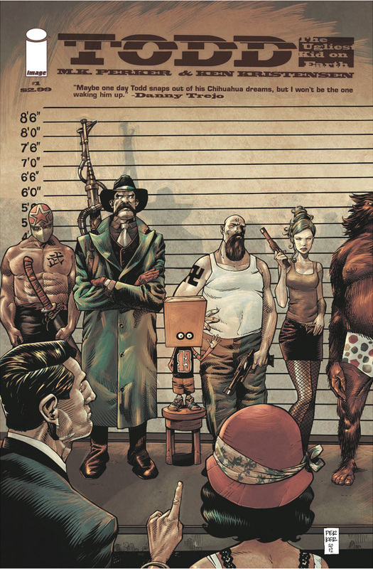
Review by: Nicole D'Andria (Originally posted on January 21st, 2013)
When Todd, The Ugliest Kid on Earth sold out the same week it came to comic book stores I wasn’t surprised. This is a good comic that deserves the attention… so why did it take me days to come up with something to say? Because this is not only a good comic book all around, but it is the definition of “set-up” and the rest of the series could go either way despite the strong start.
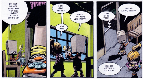
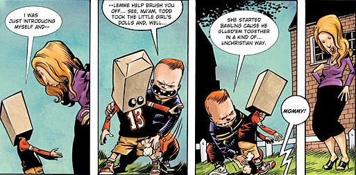
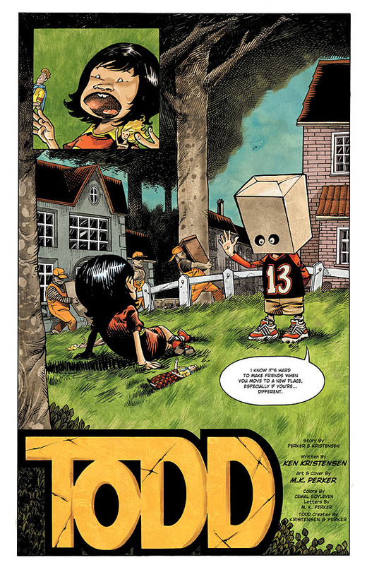
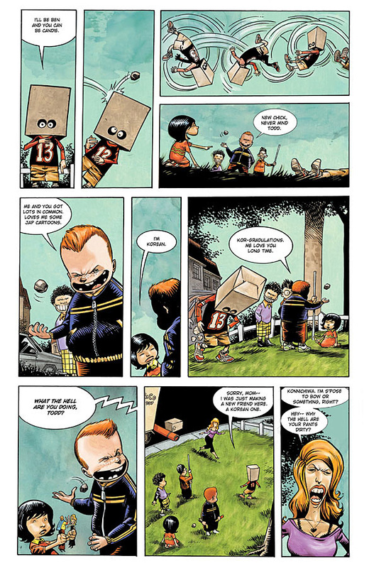
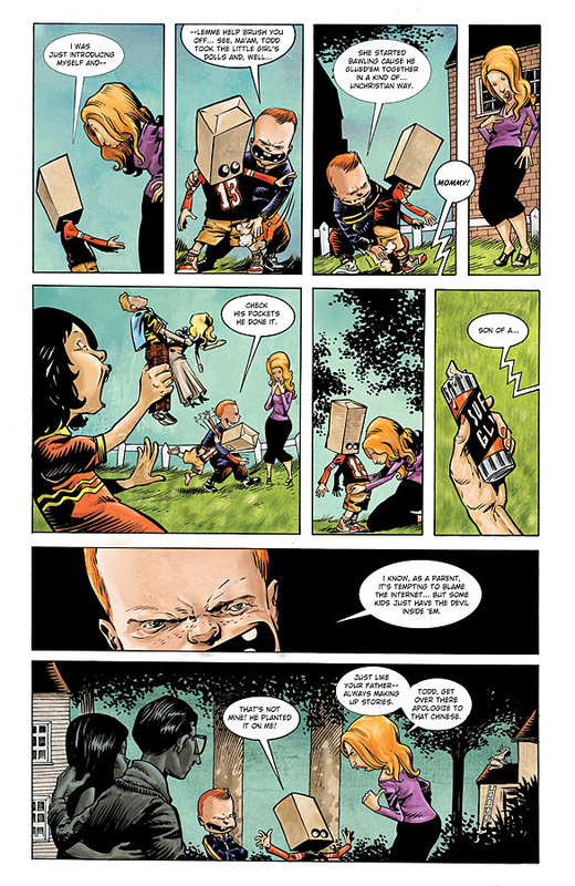
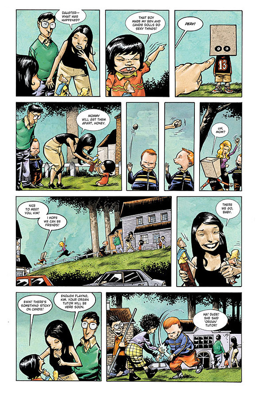
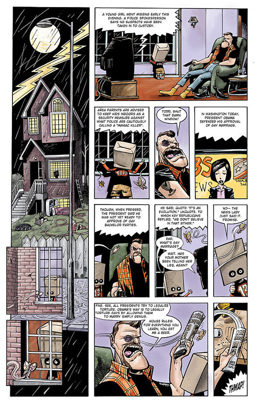
Todd, The Ugliest Kid on Earth is about an ostracized kid named Todd who wears a paper bag over his head – supposedly because he’s so ugly. Despite his appearance and outcast status Todd takes everything in stride. He tries hard to make friends but ends up being blamed for everything. It also doesn’t help that he has two parents more interested in boozing than they are in raising a son. Even worse? There’s a child killer loose in Todd’s town.
When Todd, The Ugliest Kid on Earth sold out the same week it came to comic book stores I wasn’t surprised. This is a good comic that deserves the attention… so why did it take me days to come up with something to say? Because this is not only a good comic book all around, but it is the definition of “set-up” and the rest of the series could go either way despite the strong start.
Todd, The Ugliest Kid on Earth is about an ostracized kid named Todd who wears a paper bag over his head – supposedly because he’s so ugly. Despite his appearance and outcast status Todd takes everything in stride. He tries hard to make friends but ends up being blamed for everything. It also doesn’t help that he has two parents more interested in boozing than they are in raising a son. Even worse? There’s a child killer loose in Todd’s town.
The story created by writer Ken Kristensen and artist M.K. Perker takes its time setting up in this issue. The ending seems to be a perfect segue into the rest of what the series is about. But before that we really get very little background information about Todd and his family other than the fact that everyone blames Todd for everything and his parents love their beer.
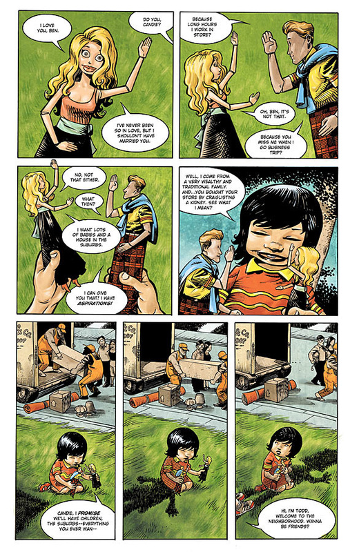
The tone of this issue is an impressive feat – despite the terrible situation Todd is in, you’ll still find yourself laughing. My biggest worry about Todd was that the humor promised would contain tons of curses and be more vulgar than necessary. Thankfully all the humor is great. The themes are still mature, so I wouldn’t offer this title up to younger readers, but I like how they don’t spam curses like titles similar to Happy do. In fact the only character that I clearly remember cursing was a frog. There are others but that frog was memorable. Some of the best laughs are centered around the Barbie and Ken of the Todd universe, aptly named Candie and Ben who open the issue. Those two have issues. And they serve as a somewhat poor plot device thanks to Ben’s sticky crotch. Another small touch that I loved and want to mention was the cup Todd’s mother uses when she’s drinking alcohol. It’s shaped like a silo and the top, middle and bottom are labeled “Sober,” “Drunk” and “Wasted” respectively. Todd’s mom might just be an alcoholic.
The tone of this issue is an impressive feat – despite the terrible situation Todd is in, you’ll still find yourself laughing. My biggest worry about Todd was that the humor promised would contain tons of curses and be more vulgar than necessary. Thankfully all the humor is great. The themes are still mature, so I wouldn’t offer this title up to younger readers, but I like how they don’t spam curses like titles similar to Happy do. In fact the only character that I clearly remember cursing was a frog. There are others but that frog was memorable. Some of the best laughs are centered around the Barbie and Ken of the Todd universe, aptly named Candie and Ben who open the issue. Those two have issues. And they serve as a somewhat poor plot device thanks to Ben’s sticky crotch. Another small touch that I loved and want to mention was the cup Todd’s mother uses when she’s drinking alcohol. It’s shaped like a silo and the top, middle and bottom are labeled “Sober,” “Drunk” and “Wasted” respectively. Todd’s mom might just be an alcoholic.
M.K. Perker has a different art style than the usual over lined and overshadowed Image Comics sometimes has. The best way to describe Perker’s artwork is by comparing it to the artwork in Mad. His characters have purposely over-exaggerated features like Todd’s huge-lipped and buck-toothed mother. This style really reflects the humorous tone of the comic and reflects the same thing that Mad does: a satire of the world. The colors also add a nice painted touch. But this style can be off-putting to some readers.
Todd, The Ugliest Kid on Earth #1 feels different than any other titles I have been reading in the last couple of years, and that’s mostly meant to be a compliment. With the right audience who appreciates something with a sad undertone covered with humorous adult-themed overtones and who like Perker’s unique style will enjoy this issue. Hopefully, this set-up leads to a compelling story that can reach its conclusion gradually… after all there are only going to be four issues. All I know the first 1/4th has been satisfying. If it’s your cup of booze.
Todd, The Ugliest Kid on Earth #1 feels different than any other titles I have been reading in the last couple of years, and that’s mostly meant to be a compliment. With the right audience who appreciates something with a sad undertone covered with humorous adult-themed overtones and who like Perker’s unique style will enjoy this issue. Hopefully, this set-up leads to a compelling story that can reach its conclusion gradually… after all there are only going to be four issues. All I know the first 1/4th has been satisfying. If it’s your cup of booze.
Preview:
You Might Also Like...
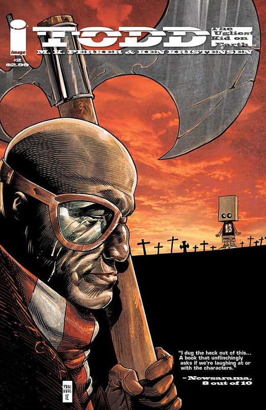
Todd, The Ugliest Kid on Earth #2 Review
|
Todd, The Ugliest Kid on Earth TV Series Announced
|
|
|
