Review by: Nicole D'Andria (Originally posted on November 1st, 2011)
After a promising first issue the second issue fails to live up to its predecessor, but is an interesting read with a great story shaping up and some artwork choices ranging from average to excellent. The characters are less entertaining and the dialogue can get too lengthy, but while far from perfect, the issue is solid.
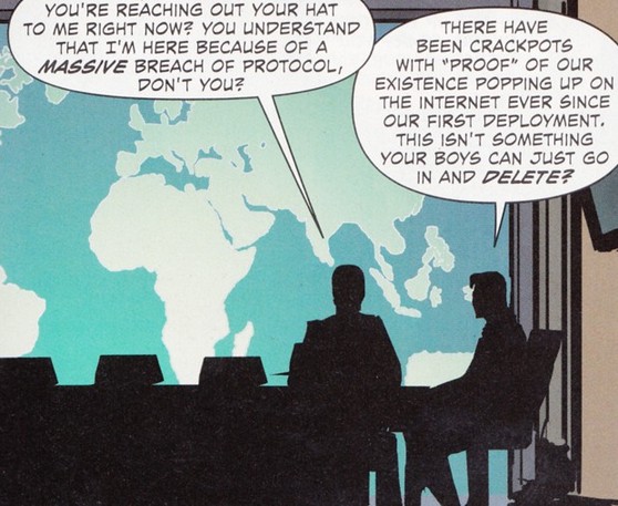
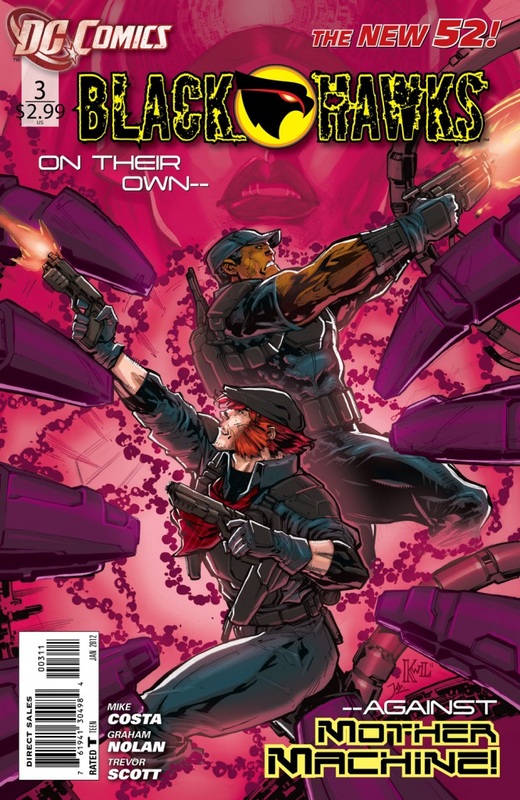
The technologically advanced team of Blackhawks explore the site of an explosion and run into an armor enforced foe, Titus, who is working for a mysterious employer known simply as mother. With the help of an infected friend the team bring him in for questioning while their captain is chewed out for the Blackhawks' exposure on the internet.
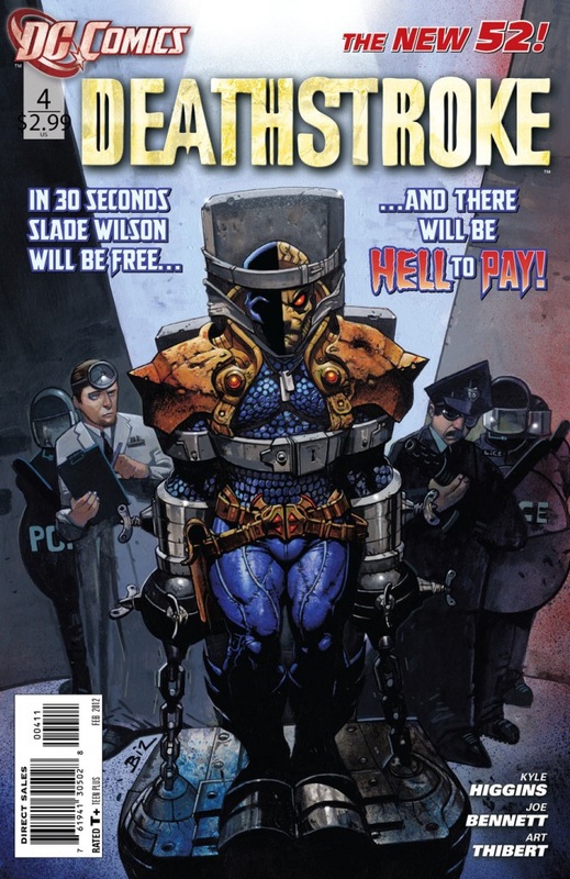
Writer Mike Costa can create a very interesting story and an entertaining one, and he manages to do that here. The characters are not given much focus like they were in the first issue which is disappointing, and the revamped Lady Blackhawk does not have a very enjoyable personality. Compared to the first issue, where the characters were very distinguishable from one another, some of the characters felt very similar and were hard to tell apart. The team felt way too big this issue and could have benefitted from lesser numbers. Kunoichi continues to be the most interesting and memorable character though as she deals with her new abilities gained from nanobites. Another unique concept is the team's vulnerability, but unlike Deathstroke who seemed on Superman's level and Superboy who was barely a threat, this team's vulnerability makes sense and is balanced well.
Costa also balances two main story elements well together: The dangers the team faces physically and the dangers they face by being exposed publically. Unfortunately the third element of drama that was in the first issue between characters is absent., but with everything else going on in the issue it would make it feel even more cramped, which it already slightly does, with teammates doing several different missions that is too much at one time.
The dialogue is also too much at times. The characters have a tendency to talk way too long, sometimes in a very complex manner that makes the story less fun to read and more of a chore. This is only a minor problem since the overarching story is interesting enough to keep readers entertained, but the dialogue could use some work or else the issue will become tedious to read.
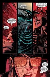
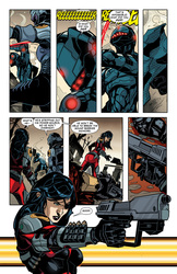
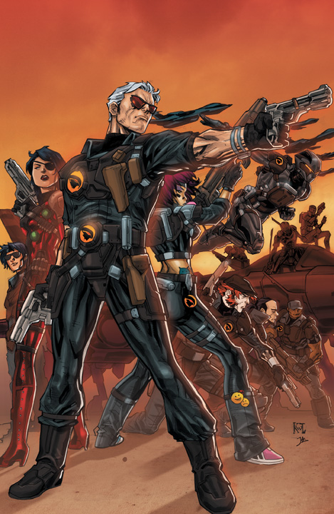
The layouts are done by Graham Nolan and Trevor McCarthy and far surpass the original with only a few issues. The layout of the panels is a bit odd, with some images taking up three fourths of the top page and panels everywhere else. It is an unconventional way of placing panels that does not work out in the comics favor. The backgrounds in those characters are often neglected, but the character in them have a unique style. The leader of the Blackhawks is drawn in an interesting style with his shades making him look very cool and the art has a similar effect on all the other characters.
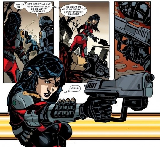
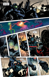
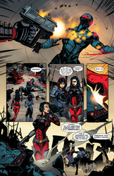
The action scenes are great. The artwork showing the fight between the Blackhawks and Titus is excellent with great action shots that never make the reader confused with what is happening and never feel cramped. It is paced out well with a lot of thrill-induced tension, just like the rest of the story.
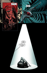
The colors from Guy Major are also great, with the battlefield the team fight in a murky brown, making a great contrast between it and the armor clad fighters. More uses of color are shown in an interrogation between Titus and the Blackhawks captain, with Titus in a dark room with one bright spotlight on him. The color added to the tone of the scene and made it a really suspenseful one.
This issue of Blackhawks was paced well and the story and artwork were enjoyable. The dialogue could be less extensive and character, could be looked at more in depth, but at this moment Blackhawks is an enjoyable series. Original fans may not be thrilled with the new high-tech direction, but for fans of action comics, specifically fans of Marvel's team S.H.I.E.L.D. and GI Joe, Blackhawks is a great newcomer-to-the-DC Universe title.
Preview:
You Might Also Like...
|
|
